How to use color in cinematography comes down to choosing a small palette from the script, building it into sets, costumes and light before shooting, and then grading to protect it. Planning does most of the work; grading only refines.
Color is one stage of a bigger process, and the hub that explains how is an independent film made shows where it fits between script and delivery. The sections below follow the same order a production does: why color works, how to build a palette, how to carry it through shooting, and how to grade for consistency.
How color shapes mood and story
Color acts on an audience through three adjustable properties, and each one changes how a shot feels. Studiovity describes color theory in cinema as built on hue, saturation and value: the color itself, how intense it is, and how light or dark it is. Treat them as three separate dials rather than one choice of “a color”.
Saturation and brightness often carry more emotion than hue alone. Filmustage explains that high saturation with high brightness reads as energetic and joyful, while low saturation with low brightness reads as somber. If a scene needs to feel heavy, pulling saturation down may do more than changing the hue.
Hue associations give you a starting vocabulary. Domestika says blue is usually associated with calm and introspection, and CineD notes that a strong red has been shown to raise blood pressure while blue has a calming effect. Use these as tendencies, not rules. A cool blue can read as restful in one film and as distance in another, depending on what the story has already taught the audience.
Color also organises story structure. In Traffic (2000), Filmustage describes a distinct palette for each storyline: a cool blue for the East Coast, a sun-baked yellow for Mexico and a green tint for San Diego. The audience can tell which thread they are in before any dialogue or caption. That is the most practical use of color in narrative: tie a palette to a place, a world or a state of mind, and keep it tied.
Building a color palette in preproduction
A color palette is built from the script outward, and it belongs in preproduction rather than in the edit suite. Studiovity states that successful productions do not leave color to post-production and instead integrate it from the earliest stages, including screenwriting and previsualization.
Start from the script and a mood board
Begin by reading the script for themes, emotions and visual elements, which is the first step in Filmustage’s mood board process. Then select a primary palette that reflects the tone of the whole film, using either harmonious or contrasting combinations. Studiovity recommends attaching a mood board of reference images to the shot list, so the palette stays tied to specific shots instead of floating as a general idea.
Choose a scheme and assign roles
Once the tone is clear, pick a scheme from the color wheel. The three common options behave differently on screen, and the choice depends on how much tension the story needs.
| Scheme | How it is built | Effect on screen | Planning use |
|---|---|---|---|
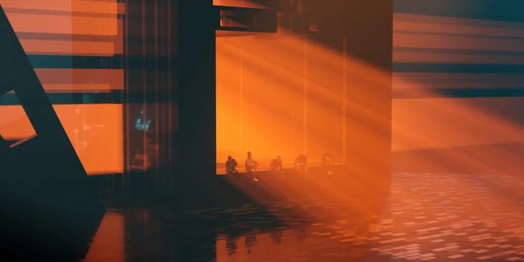
| Complementary | Colors from opposite sides of the wheel, such as orange and teal | High contrast and vibrancy, pairing warm with cool | Suits stories built on conflict or two opposing worlds |
| Analogous | Colors that sit next to each other on the wheel | Harmony with less tension and less contrast | Suits unified, calm or immersive scenes |
| Triadic | Three colors spaced evenly around the wheel, with one dominant | Varied color held together by a single leading hue | Suits busier worlds that still need one clear anchor |
Scheme definitions here follow CineD’s guide to film color schemes, with the orange and teal example from Studiovity.
Whichever scheme you choose, give each color a job. CineD advises letting one color dominate, a second support it, and keeping accents to neutrals such as blacks, whites and greys. A palette with defined roles is easy to hand to other departments and easy to check later, because any frame either follows the hierarchy or does not.

Palettes that tie color to story conditions
Two well-documented examples show the principle. Studiovity says the directors of The Matrix used a distinct green tint for every scene inside the simulation, with a cooler blue palette for the real world. It also describes the Las Vegas scenes of Blade Runner 2049 as bathed in a thick, oppressive orange haze. In both films the color marks a condition of the story, not a decorative choice. When you build your own palette, write down which story condition each color stands for, and drop any color that does not stand for something.
Carrying the palette through design, lighting and camera
A palette only exists on screen if the departments that put color in front of the lens agree on it. CineD says the overall look is carefully planned by the art department as a whole, in consultation with the director and cinematographer, before shooting. It also places responsibility for the look with the production designer. The reasoning matters for your planning: a colorist can only work with what the camera captured.
The director of photography therefore sits at the junction between the palette document and the physical set. That role is part of what separates cinematography from general video work, a distinction explored in Videography vs Cinematography: A Clear Guide To Their Differences And Which To Choose In 2026.
Two practical habits keep the palette intact between departments:
- Tag color requirements early. Studiovity says that tagging specific props, costumes and set dressing early aligns production design with the color strategy. A red prop that arrives late and in the wrong shade breaks the dominant, supporting and accent hierarchy before the camera rolls.
- Plan lighting color as carefully as wardrobe. Color can come from gels on lights or from natural conditions. Studiovity notes that color-specific setups take time, whether that means gelling lights or waiting for golden hour, so the schedule has to allow for it. It also says lighting tools help cinematographers previsualize color temperatures and the fixtures they will need, which lets you cost the lighting plan before the day.
Gels are the most direct way to push a light toward a palette color, but they only help if the set beneath them has been designed for that color. A teal gel over a set painted in clashing tones makes the clash more visible, not less. Test the gel against the actual wardrobe and walls before the shoot day.
Crew members new to a set will meet these decisions as call sheets, wardrobe notes and lighting changes. How To Start As A Film Production Assistant: A Practical Guide For 2026 is a useful companion for anyone working their way onto productions where these plans are carried out.
Grading for consistency from the palette
Grading is where the palette is protected, not invented. Filmustage observes that digital technology has given filmmakers unprecedented control over color, but CineD’s point still holds: the grade works on the image that was shot. A consistent result comes from treating the preproduction palette as the grading brief.
A palette-to-grade workflow runs in this order:
- Hand over the palette guide. Give the colorist the mood board, the dominant, supporting and accent roles, and reference frames from testing or the shoot. The grade then has a target instead of a mood.
- Match shots within each scene first. Bring the shots in a scene to one consistent look before adding any style, so later changes do not have to fight mismatches.
- Check each scene against its role in the palette. Ask whether the dominant color still dominates and whether accents have stayed neutral or restrained, as CineD’s roles suggest.
- Compare across scenes that share a story condition. If a palette marks a place or world, as in Traffic or The Matrix, every scene in that world should sit inside the same color range.
- Approve key frames with the director and director of photography. Keep reference stills of the approved frames so later scenes, trailers and deliverables can match them.
If shots arrive with colors that fight the palette, such as a wrong wardrobe shade or uncontrolled mixed light, grading can reduce the problem but may not remove it. That is why the earlier sections spend so much time on prevention.

Frequently asked questions
How much does color grading cost?
Filmustage says color grading for a major Hollywood production can cost upwards of $300,000. That figure describes the top end of the industry, so smaller productions should budget for grading as a real line item rather than assuming it is free, and should plan the palette well enough that the grade stays simple.
What do red and green usually signal on screen?
Domestika says red has traditionally been associated with intense and uncontrollable feelings such as passion, danger and rage. It says green is not only a color of nature but is often linked to corruption and the sinister, and notes that many villains are associated with green. Use both as conventions you can follow or deliberately reverse.
Is orange and teal the only complementary pair?
No. A complementary scheme pairs any two colors on opposite sides of the color wheel, and CineD gives orange with blue or teal as examples of warm set against cool. Orange and teal is simply the pairing most often cited for high contrast and vibrancy.