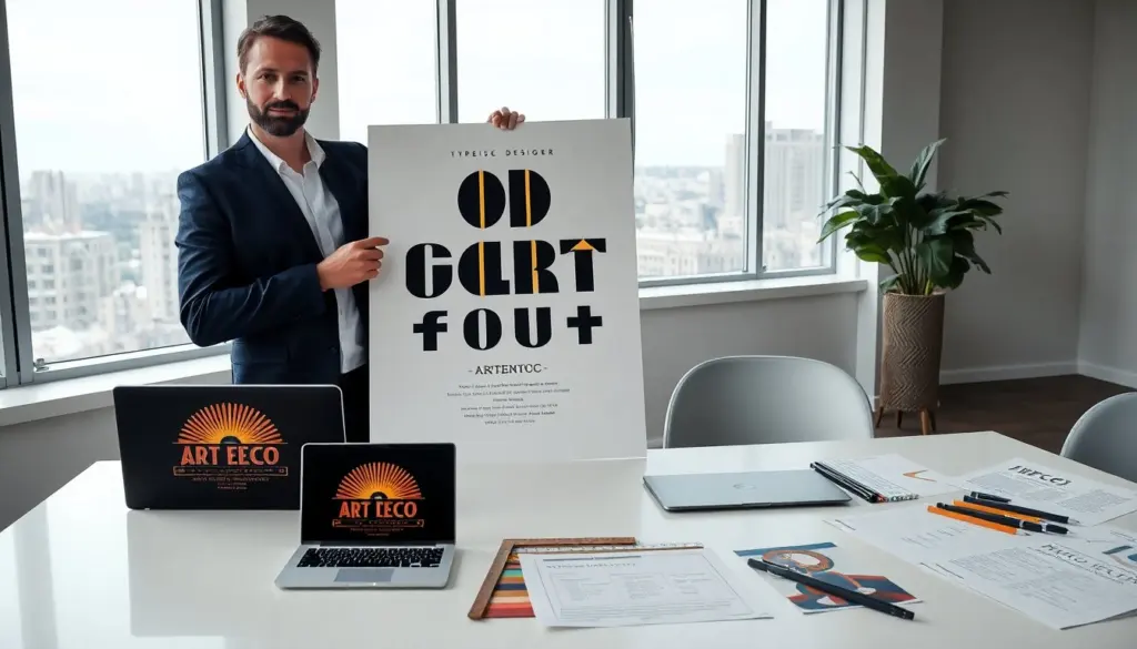
Art deco fonts offer a clear visual voice for stylish projects. The designer uses art deco fonts to signal luxury, geometry, and era-specific flair. The reader sees strong lines, high contrast, and decorative elements. This introduction sets expectations for practical use, style choices, and pairing advice for art deco fonts.
Key Takeaways
- Art deco fonts are characterized by geometric shapes, high contrast between thick and thin strokes, decorative details, and wide letter spacing to enhance legibility and visual impact.
- These fonts evoke 1920s and 1930s glamour and industry, making them ideal for vintage-inspired, stylish projects that require a confident design voice.
- Geometric sans and display art deco fonts work best for headlines, posters, and signage due to their readability and striking presence at large sizes.
- Pairing an art deco font with a neutral modern font maintains clarity and usability while allowing the art deco style to stand out.
- Use metallic or deep jewel tone colors and flat backgrounds with art deco fonts to create impactful visuals, while avoiding busy patterns that compete with decorative letterforms.
- In responsive design, scaling and adjusting letter spacing of art deco fonts preserves legibility on smaller screens and diverse devices.
What Defines Art Deco Typography? Key Characteristics
Art deco fonts share a small set of clear traits. They use geometric shapes and straight lines to create form. They pair thin strokes with thick strokes to make contrast. They add decorative elements such as stepped serifs, sunburst motifs, and chrome-like curves. They keep letter spacing wide in many display styles to improve legibility and presence.
The style traces to the 1920s and 1930s. Designers then emphasized industry, progress, and glamour. The era favored streamlined forms that still looked ornate on posters, theater signs, and product packaging. Modern designers choose art deco fonts when they want a voice that reads as vintage and confident.
Designers note that art deco fonts vary by weight and ornament. Some designs focus on rigid geometry. Others focus on flourishes and thin connecting lines. The user should match the font variant to the visual goal: strong headlines, decorative logos, or subtle headers.
Popular Art Deco Font Styles And When To Use Them
Geometric sans and display fonts and ornamental and script variants each serve distinct roles. The designer should pick a style based on hierarchy, medium, and tone. Below are clear rules for use and a short list of common applications for art deco fonts.
Geometric Sans And Display Fonts
Geometric sans and display fonts give a clean, industrial look. They use circles, rectangles, and straight lines to form letters. Designers use geometric art deco fonts for titles, posters, and signage because these fonts scale well and remain readable at distance.
A typical use case places a geometric art deco font on a headline with a neutral sans for body text. This contrast keeps the layout modern while preserving period style. The designer should limit geometric display fonts to short lines and large sizes. They work best in print covers, event posters, and site hero headers.
Examples of geometric art deco fonts include those with exaggerated verticals, wide letterforms, and compact counters. The designer may choose a condensed geometric face when space is tight. They may choose an expanded display when they want theatrical presence.
How To Pair Art Deco Fonts With Modern Layouts
Designers pair art deco fonts with modern layouts through clear hierarchy and measured contrast. They pick one art deco font as the focal type. They pick one neutral support font for body copy. They keep the total number of typefaces to two or three.
The designer sets scale to emphasize the art deco headline. They increase letter spacing on the headline to highlight form. They keep body copy at a readable size and line length. This balance preserves clarity and lets the art deco fonts show character without reducing usability.
Color choices affect perception. Designers often use metallic colors, deep jewel tones, or high-contrast black and white to match art deco fonts. They use flat color blocks behind large display letters to increase impact. They avoid busy backgrounds behind ornate letterforms.
Grid and alignment choices improve pairing. Designers use asymmetric grids to make layouts feel modern while retaining period typography. They align decorative headlines to a strong baseline grid so the rest of the page holds steady. They insert breathing space around decorative words to prevent collisions with images.
Responsive design requires care. Designers scale the art deco headline down on small screens and adjust letter spacing to keep letters distinct. They may swap a heavy display art deco font for a simpler geometric variant on mobile to preserve legibility.
Finally, the designer tests printing and screens before final delivery. Some art deco fonts lose fine details in low-resolution printing. Designers adjust stroke weight or choose a slightly bolder cut for print. They also preview web fonts across browsers to confirm consistent rendering.